We were delighted to work on this project as it ticks a lot of boxes form us, not only does it tick our design boxes but it all ticks our cycling passion box too….. so what’s not to like!
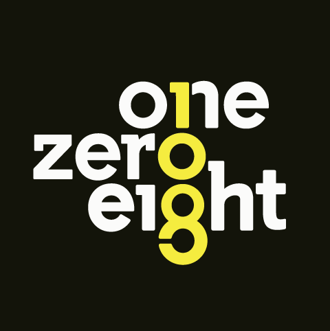
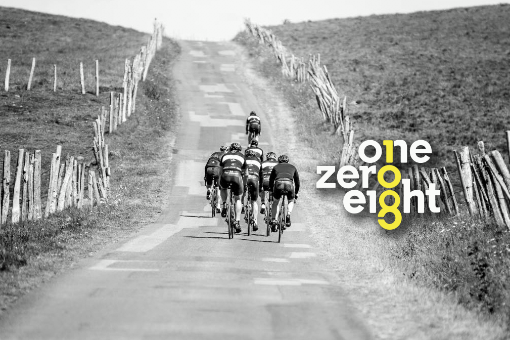
First off was the branding, creating a logo around the number 108 seems simple, but in reflection when you’re trying to accomplish something that’s “stand out” it was anything but. The out come was a typographic concept that worked well on so many levels, a concept that uses both a numeric and written form of the number. The final concept was a strong and bold design that when you look at you think, huh… that’s clever!
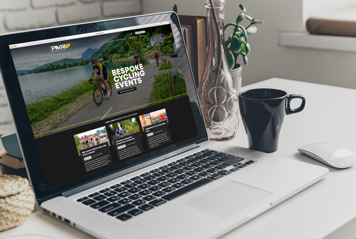
Next, the website had to convey the same ethos, a site that would showcase upcoming events and company information.
www.onezeroeight.co.uk
Task
Branding


